12 Mar 2026
An evening giving Murmr a face lift
A night of UI polish across iOS, macOS, and watchOS—and why the Apple tooling inside Xcode has become my go-to for SwiftUI UI work.
I spent the evening giving Murmr a face lift. I used the Codex and Claude Code tools built into Xcode, and wow—what a difference when it comes to SwiftUI development, specifically the actual UI work. Codex and Claude Code on their own do pretty well with the wider architecture, but the Apple tooling inside Xcode is a step up for creating UI: layout, visuals, and that “feel” that makes recording feel alive.
Here’s what got done tonight across the app.
Recording experience (iOS & macOS)
-
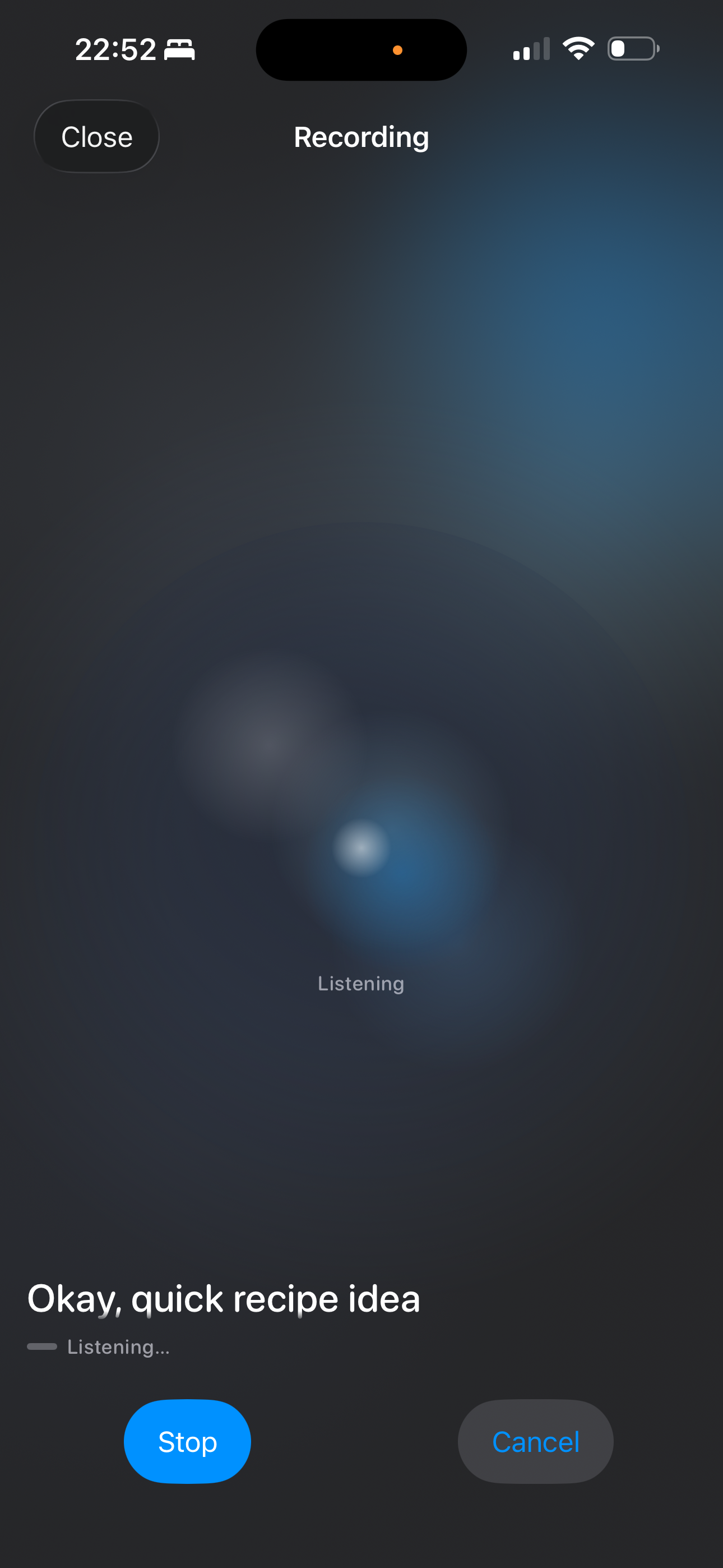
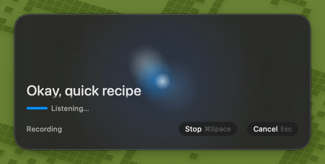
Recording orb as background — The glassy recording orb is no longer a small strip above the transcript. On both iPhone and Mac it now fills the recording screen as a full-bleed background, with the phase label, live transcript, and controls overlaid on top. Recording feels like the orb is the room.
-
RecordingWaveformView overhaul — The shared orb view was refactored with a proper color palette (
RecordingOrbPalette) for light and dark mode (icy whites and deep blues in dark; soft blues and pale indigo in light), internal blooms that drift and respond to voice, a central core highlight, and a top-left specular glint. Audio drives the motion with asymmetric attack/release so it breathes with speech.
-
RecordingDisplayLevelNormalizer — Raw microphone levels are now mapped into a stable 0–1 visual meter: RMS is converted to a speech-friendly decibel range, then asymmetric smoothing and a short peak hold keep the orb visibly active between syllables instead of only on plosives.
-
Reduce-motion support — The orb respects
accessibilityReduceMotion: when enabled, it shows a static orb with opacity-only energy indication instead of animated blooms and scaling. -
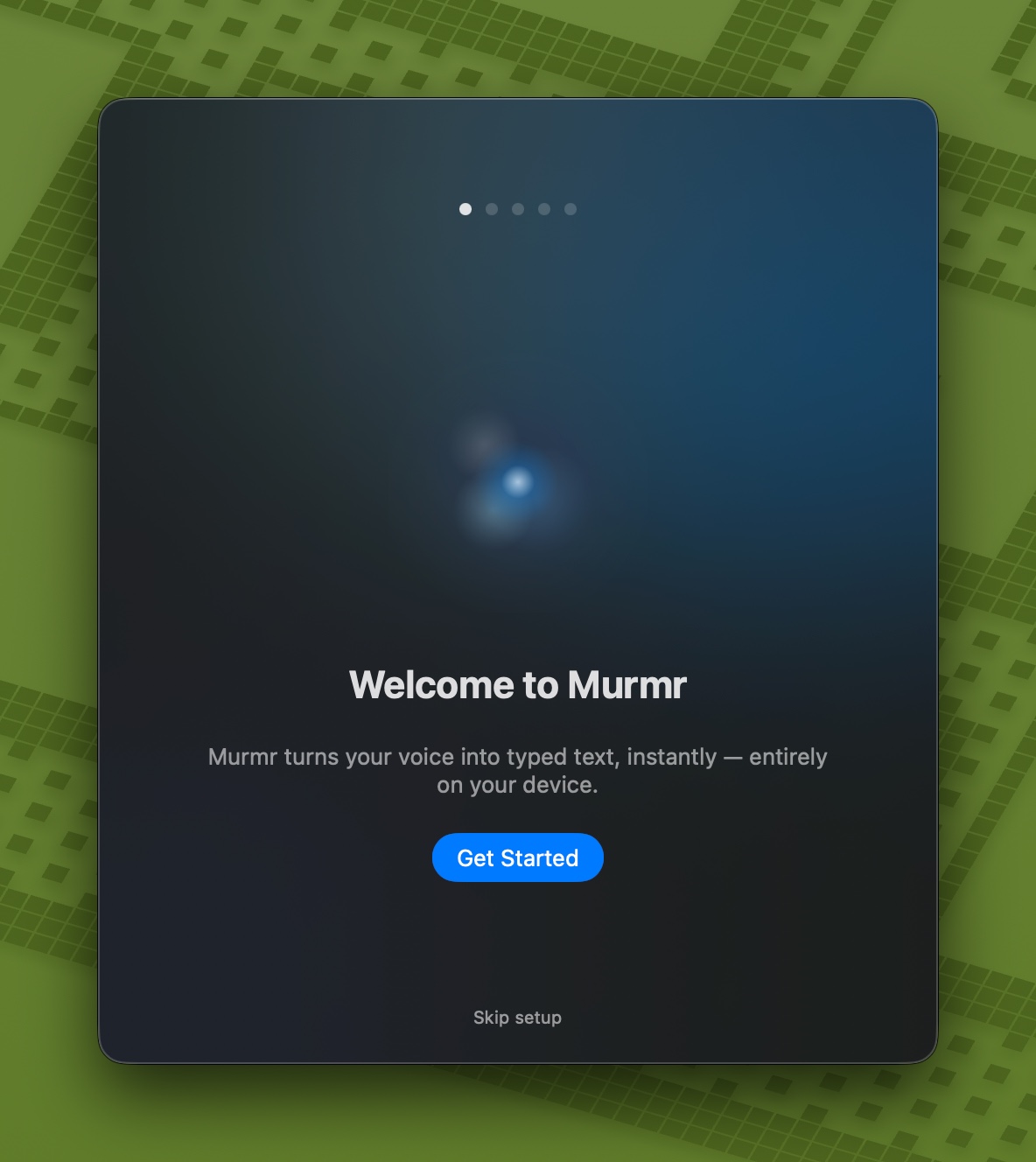
Onboarding welcome steps — The first onboarding screen on both iOS and macOS now uses the same recording orb (with a soft radial mask) instead of a static waveform icon, so new users see the same visual language they’ll get when they hit record.
Layout and presentation
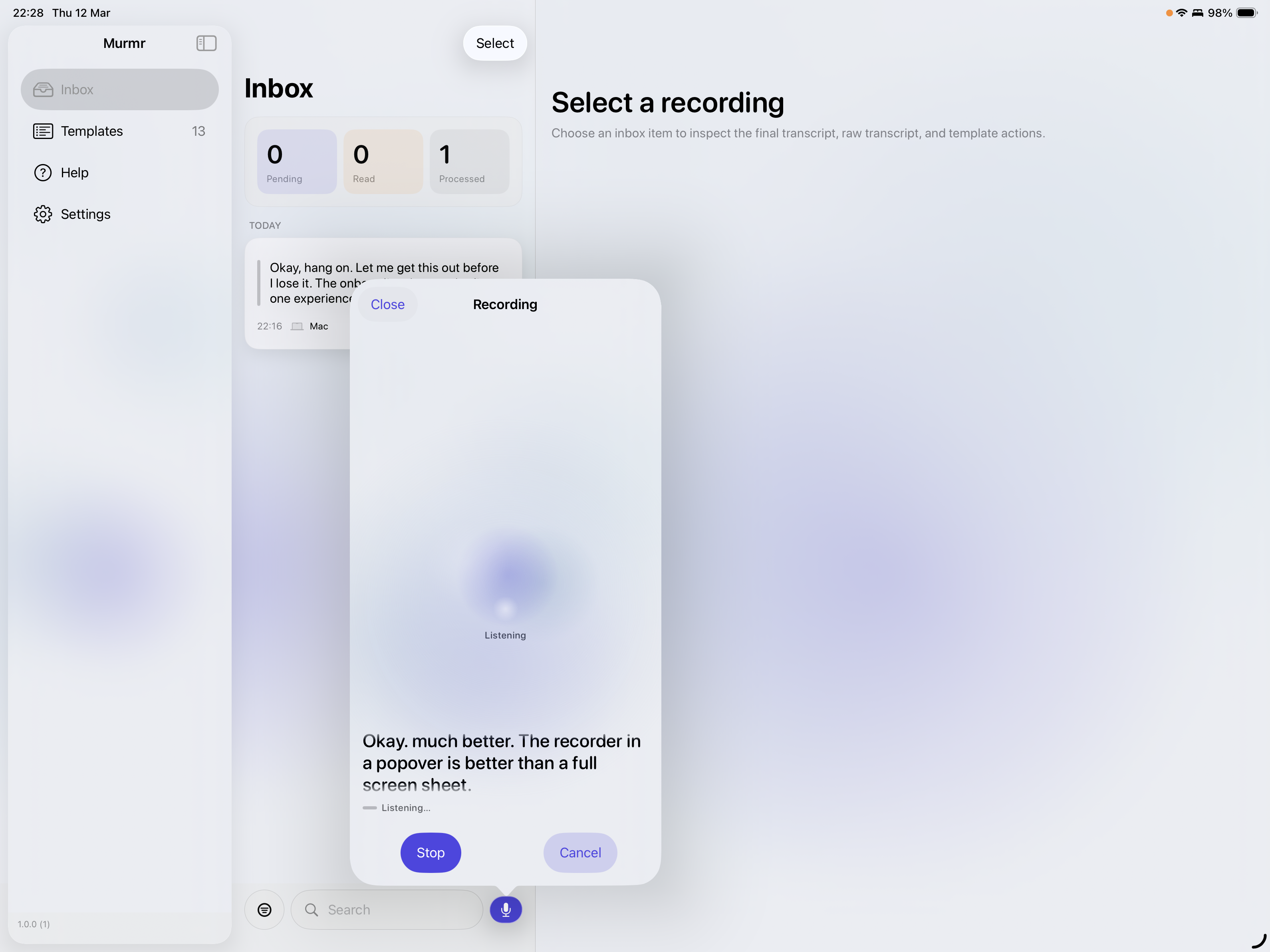
- iPad record-from-inbox — On iPad, tapping the mic in the history/inbox toolbar now presents record mode in a popover (fixed size) instead of full-screen, with
presentationCompactAdaptation(.popover)so it stays a popover in split view. iPhone keeps full-screen record.
-
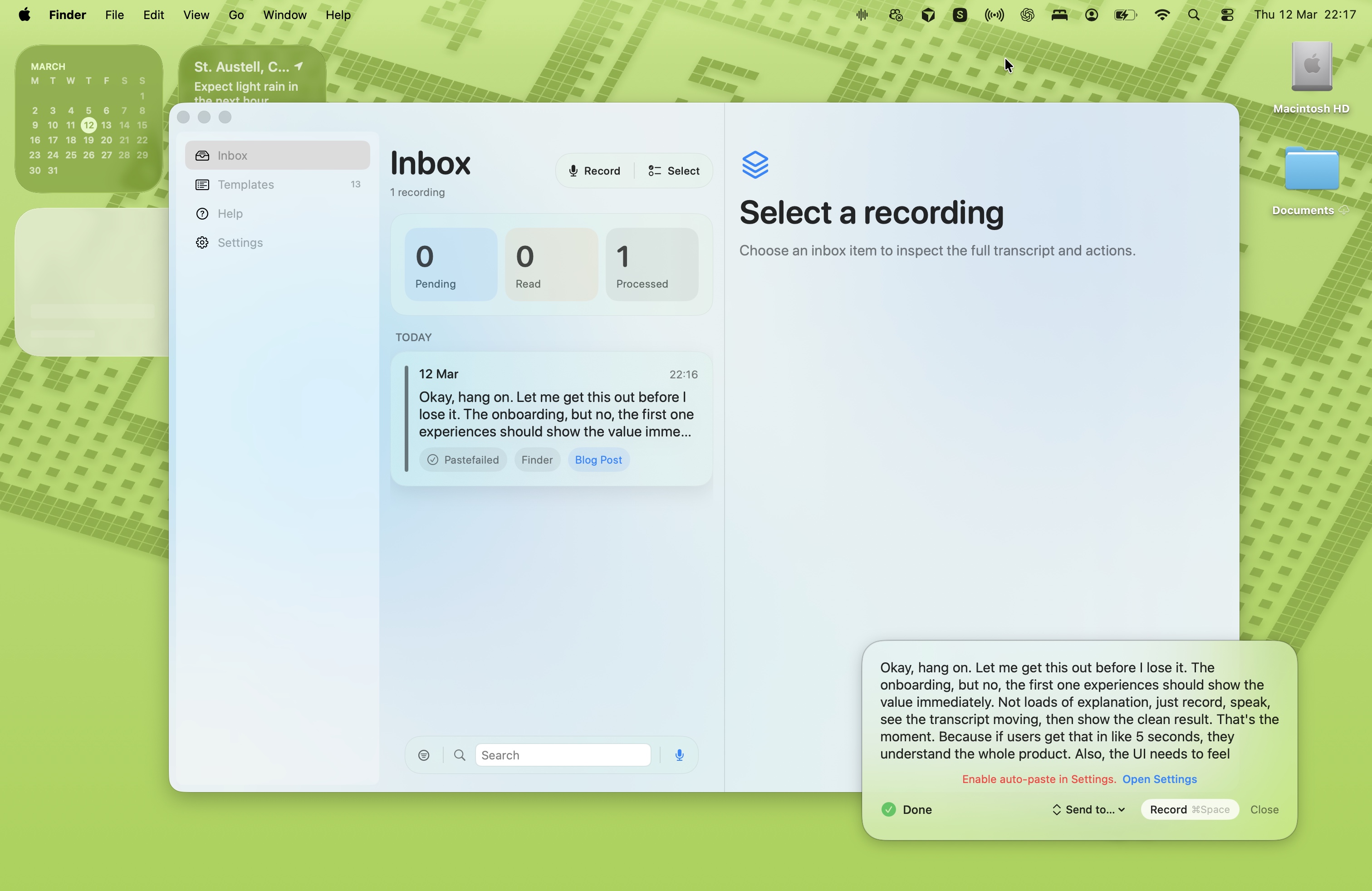
macOS recording HUD — The floating recording window uses the same full-bleed orb as background behind the transcript and stop/cancel controls, with a taller frame so the orb has room to read.
-
MurmrAmbientBackground — The gradient mesh behind main content was retuned to match the new orb palette: deep navy, teal blue, icy pale blue, and brand accent in dark mode; aligned tweaks in light so the whole app feels consistent.
watchOS (in progress)
-
WatchRecordingButton — The in-progress watch UI replaces the old bar-style “waveform orb” with a WatchButtonOrb: a small Canvas-drawn orb with radial glow, glass body, orbiting blooms, and a central core, aligned with the iOS/macOS orb language so the watch feels part of the same product.
-
PushToTalkView — watchOS push-to-talk flow is being updated to use the new orb and layout patterns so the watch recording experience matches the rest of the stack.
Shared and project
-
AudioLevelSmoother — Existing frame-rate–independent smoother kept; RecordingDisplayLevelNormalizer added in the same file for decibel mapping and peak-hold smoothing used by the orb.
-
Localization — Minor string reordering in
Localizable.xcstringsand a new string for the watch inbox (“Choose an inbox item to inspect the full transcript and actions.”). -
PreviewFactory (macOS) — New previews added for the updated macOS views so UI iterations stay fast.
The website got love too: a new Help section at /help with FAQ, Templates & Destinations explainers, Obsidian-native support and “more coming” copy, a TestFlight helper page, and clearer privacy wording (including “once exported, it’s out of Murmr’s control”). That’s a separate post if we want to go into it.
Bottom line: when the task is “make this screen feel right,” the in-Xcode tools have become my first choice. For architecture and cross-cutting concerns, the external assistants still shine. For the actual UI—orb, gradients, layout, and motion—the Apple-integrated experience is the one that got this face lift done in an evening.
I'll get around to updating the website screenshots with this new UI and I'll record some better demo vidoes. But Its been a bsuy week and this is still a side-project scenario.
Evenings and weekends (sort of... spare time when you have two young kids is hard to come by). So after a week of late nights with my friends Claude and Codex I think I'll give myself tomorrow off and enjoy a friday night away from the Macbook.
More to come soon!
Ben Murmr Deveoloper, Designer and Chief Prompter!